Dec 22, 2010

Paper Christmas Tree

This year I decided I wanted to create my own Christmas Village made entirely of scrapbook paper for the table that I display all the Christmas cards we receive on.  While my shopping spree on Black Friday I bought three Styrofoam trees in varying sizes.  I then chose the paper I wished to use which was Basic Grey's Jovial Collection; I just loved all the colors!  Then using my Cricut Design Studio, I created an entire sheet (12x12) of one inch hearts.  I then ran this through my Cricut for every pattern I choose, which I think was about eleven.  After I had all of my hearts cut out and stacked by pattern in the order I wanted to apply them, I got to work on layering one by one.  I would take a heart, curl the wide end around the end of my paper piercer so that it would flip up, apply a little bit of Fabric Tac to the point of the heart and then place and hold onto the Styrofoam.  Continue all the way around and then start on the next row.  I did about three to five rows and then set it aside to let it dry.  I found this necessary as I would keep bumping lower rows that were wet and knocking the hearts out of place if I didn't.  I tried the glue gun but found it way to bulky and I liked the play the Fabric Tac gave me so that I could make minor adjustments if my row was a little crooked.   I worked all my way to the top and then covered the top by placing three heart points together on the top with glue, allowed it to dry, and then folded the overhanging part down and curled it with my paper piercer.  I am now on the look out to find some stars that will work perfectly for tops. 


I was hoping to at least get one house finished as well, but the tree took a lot more time than I anticipated so it doesn't look like the houses will be ready this year.  If anyone would like the cut file for the hearts let me know and I will email it to you.

This will be it for me until the new year as I am off to Jamaica for a week!  I want to wish you all a very Merry Christmas and a healthy and prosperous 2011!

Dec 20, 2010

Blog Hop Winner!

Thank you everyone for your kind comments on my blog hop post.  It was so much fun!  As promised, I have done a random draw for a little Christmas RAK and the lucky winner is .....


Congratulations Steff! Please send your mailing info to me at jenniferdewolfe@gmail.com and I will get your RAK out to you right away.

Thanks again, everyone and come back again!

Dec 16, 2010

Holiday Candle & Blog Hop

Hello and welcome to my first ever blog hop I am so excited to participate and would like to Thank Amanda for letting me join! I am the last stop on the blog hop and you should of arrived here from Laurie's Blog, but if you didn't you can go back to the begining and start here at Amanda's Blog .


With the holidays almost here, it's inevitable that at the last moment I will realize I forgot to get a gift for someone.  I've done this too many times to count. Well today I want to show you a quick and easy gift you can make with supplied you probably already have in your stash.


You will need a candle, patterned paper, ribbon, a marker in any color doesn't matter, liquid glue, glue gun and some embellishments.  First thing you need to do is cut the strips of patterned paper that you will roll into tubes.  Measure the height of your candle and this will be how high you will need your tubes to be, my candle was just shy of 4 inches so I cut at 4 inches.  Be careful when making this cut that the pattern paper is facing the right direction other wise when you roll the tubes your pattern might go the wrong way.  Now you will need to take this cut piece  and cut it into 2 inch strips.  Now how many strips you will need will depend on how big around your candle is and how small you make your tubes.  This candle used 29 tubes.  I used various pieces of Basic Grey's Eskimo Kisses collection which made co-ordination a breeze.  So now that you have your strips cut, starts the fun part.  Take one of your strips and lay it face down in front of you and take a marker out of collection.  I used a Zig maker which the 2 inches wrapped around just perfectly, if your marker is different in size you might have to adjust for that.  Roll the strip around the marker, not too tight or you might have a hard time sliding off.  One thing to be careful of is if your marker is tapered and if it is you will have to play with this to make sure the roll is as even as possible.  At the edge apply some liquid glue and hold around the marker until the adhesive is set.  I used glossy accents and it took about 20 seconds to set.  Repeat this with all your strips until they are all in tubes.  Arrange all the tubes in the pattern/order you want to apply them as it will make it a lot easier for work your way through.  Now take a hot glue gun and run a bead all the way down the length of the candle and quickly set your first tube in place.  Hold it there until the glue cools.  Now work your way around the candle until you have gone all the way around.  Take a piece of ribbon or tulle and tie it around the candle and embellish as you please.


Please leave a comment telling me what you thought of this post and what you might like to see in the future and I will do a random draw on Dec 20th at noon for a little Christmas RAK for one lucky winner.
Now back to the Blog Hop, along the way, you have been collecting words. The word from my blogs is IT'S. Now if you have followed the blog hop as intended you should have 8 words/phrases. Unscramble them and leave a comment on Amanda's Blog, she will draw a random winner Monday Dec 20.

Thanks for stopping by and I hope you enjoyed the blog hop!
Merry Christmas!

Dec 13, 2010

Festive

Tradition is a big thing in my family, especially when it comes to Christmas. I wanted to document that. Every year we go over to my parents place to help them decorate their Christmas tree for Christmas. To me this always signals the start of the Christmas season for me.

Dec 12, 2010

A Christmas Tradition


Another layout about our family Christmas traditions.  I have become obsessed with border punches lately and find I am using them where ever possible.  I find it give a nice transition between patterned papers.  The bling on this layout really didn't match the look I was going for so I took a copic marker and coloured them until I achieved the colour I desired.  Of course in this picture they look kind of yellow but in real life it looks more green.

Dec 11, 2010

Dog Gone Christmas


I love the curve on this layout, so much so that I had to emphasize it.  I did some stitching along the one edge and then wrote my journalling over top of it.

Dec 4, 2010

Season's Greetings


Another round of cards complete and I think I am done except for a few I have to make for work.  I really like the colors on this card and it was real simple to make.

Dec 3, 2010

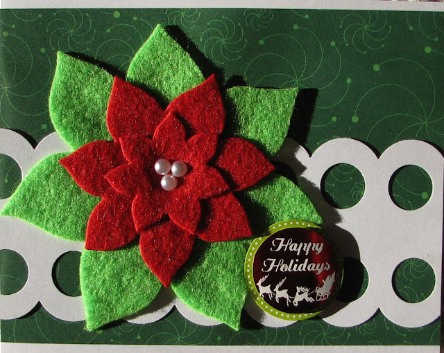
Happy Holidays


Another Christmas card is done!  This one I used my Nestabilities dies and some red and green felt to make my Piontsetta flower.  I really like how it turned out!

Nov 18, 2010

All Is Bright


This is another one of my Christmas cards I am making this year.  First off I took a piece of white cardstock and cut it out using my Nestabilities Die Labels 8.  I took a swirl stamp and some clear embossing ink and stamped the now cut out white piece of paper.  I applied some clear sparkle embossing powder and heat it until it was set.  Next I took a sponge applicator and covered the entire pieces with Tim Holtz' Distress Ink in Tumbled Glass.  I then took another sponge applicator and added in Tim Holtz's  Distress Ink in Broken China starting on the outside and blending about half way in.  And then finally I took Tim Holtz' Distress Ink in Faded Jeans and lightly applied a little around the edge with a sponge applicator.  Tada, isn't it beautiful?  Now I wanted to mat that on another pattern so I took the next die size up in the Nestabilities Die Label 8 set and cut out a piece of Basic Grey's Jovial paper.  I adhered the two together.  Next I cut out another pattern in the Basic Grey's Jovial paper to 4.25"x5.5" to cover the card.  I adhered a piece of ribbon in the middle and then adhered the matted pieces on top of that.  Now the fun part becomes ... embellishing!  I decided I wanted something different for the tree so I took a pipe cleaner, bought at any craft store or even Walmart, and started at the top and started bending it back and forth making sure each layer was bigger then the previous.  I tried many different glues (fabric tack and glossy accents) to get the tree to stick to my card but it didn't seem to work so I broke out the good ol' glue gun.  Just watch your fingers!  I took a star jewel and stuck it above the tree and then added a chipboard sentiment.  And that is how I made this card.  Hope you like it!

Nov 17, 2010

Happy Holidays


Another one of my Christmas cards this year.  I love this paper collection by My Mind's Eye called Colorful Christmas.  This card was pretty easy, it's just varying sizes of paper cut and then border punched on one side and layered on top of one another.  I then used a journalling spot from the die cut sheet and a couple of the snow flakes as my greeting.  To give some of these elements I used a little bit of dimension, I added some glossy accents.  I then took my label maker and typed out Happy Holidays and adhered it to the journalling spot.  A very pretty and easy card.

Nov 16, 2010

Holidays


I will admit before I start that this was a difficult card with a lot of steps.  I'm not sure if I would do another one or not but I do love the look of it when it was done.  So I bet you are wondering how I did this.  First thing you do is create the background scene.  Cut the farthest layer (in my case the blue with the light swirl pattern) and to the size of your card.  Next, layer on the scene you want, making sure to adhere all of the layers really well as you do not want your loose (inside the pocket shaker part) items to get stuck behind them.  Once you have the scene you want, take an old bubble pack from something you purchase, I think mine came from a pack of buttons or chipboard.  Cur around the bubble part making sure you leave about a 1/4" of trim so that you have somewhere to put your glue.  Next you need to find the loose items you want to put inside the shaker part.  I used snow flakes but you could use buttons, glitter, beads, jewels, etc.  Play around with the shaker pieces and the bubble to see if you have the right amount.  Once you do pile all the shaker pieces on top, in the center, of the background you built.  Now take a good adhesive, I used Glossy Accents, and cover the lip of the bubble that will make contact with your background.  Make sure there is glue all the way around or some of your shaker items may fall out, but be careful not to apply to much or it will ooze everywhere.  Now you need to let this sit and dry (about 1/2 hr) and do not shake it until then or your shaker pieces could get stuck in some over flow adhesive. Now the tricky part, my pink piece.  You need to cut what I call a hider piece.  This hider piece will cover up all the adhesive and bubble lip of your shaker.  Now I advise not cutting the paper to the size of the card just yet.  First cut out the window to fit around your bubble piece and then when in place trim off the excess, other wise, if your window is not in the right place the hider piece won' fit the card properly.  Trust me I know!  Once I got my hider piece on, I added a piece of ribbon, a sentiment and a brad to finish it off.  Oh and of course my cute little polar bear on the front of the shaker box.

Nov 15, 2010

Warm Holiday Wishes


This is a card I made for Christmas and it was inspired by another sketch by Allison Davis. I was quite liberal with the design. For some reason when I saw this sketch, I thought of hot chocolate with swirls instead of the circles. Can you tell I'm in the Christmas mood?  The coffee cup is from Cricut's Christmas Cheer Cartridge and is cut at 3.5". I cut one out in blackout mode in white to serve as my base.  Next I cut out another one in blackout mode in brown and trimmed a little off the top so when it sat on top of the first one I cut you could see a little bit of the white at the top, which would be the back of the cup.  Next I cut out 4 of the shift + cup in white and then cut the top loop of the cup off of each.  I now stacked and glued all my layers together.  I stamped a little snow flake on the front of the cup and then took my Glossy Accents and outline it.  I also used Glossy Accents on the brown to make it look like liquid.  Because of all of the layers in this cup it now has quite a bit of dimension and weight.  I then adhered it to a piece of Cosmo Cricket Christmas paper that I had distressed the edges of.  Then I took a pencil and drew some swirls coming out of the cup and across the page.  Once I had the look I wanted I took my paper pierce and poked out the pattern.  I erased the pencil lines and then got to work on stitching.  I added a stamped sentiment and I was done.  Hope you like it.

Nov 14, 2010

Images of My Hotel

The resort we stayed at while we were in Cuba was beautiful.  I loved all the bright colors of the building, the beautiful white sandy beach, and the very friendly staff!

This is actually a 12 x 28 layout. The extra 4 inches are contained within the flap on left hand side. I use these things called Flip Flaps from Creative Memories which attach to my page protector to give me another 4 inches of layout space. Totally sweet for layouts with tons of photos.

Here's a look at what it looks like with the flap open:


This layout is based on another sketch by Allison Davis. her sketches are so awesome because she gets so many photos on a double page layout. If you have never seen her work you should check her out, you can find her blog in my  Favorite Blogs List.

Nov 13, 2010

Two Years!

It's hard to believe I have been blogging for 2 years now! Where does the time go? It has been a lot of fun that is for sure. Yes there has been times where I seemed to drop of the face of the earth but do you really blame me ... we only get 2 months of really nice weather (aka Calgary Summer) and I like to soak every minute of it up! Anyways, I just want to say thank-you for visiting and commenting on my blog and I'll see you around the blogs!

Nov 12, 2010

Wind Swept Moment

When I saw this picture of my parents I thought it had to be one of the best pictures I have ever seen of the two of them. It was taken in Cuba this past February on the beach in Varadero. It was a really windy day which gave us some awesome pictures of the ocean. I love how my Dad is going in for the kiss and my Mom is trying to hold her hair. Beautiful!


I used another sketch by Allison Davis and it called for 3 photos. Now I didn't really have three photos that I liked together because I wanted the focus to be on my parents so I decided to use another photo of just the ocean instead and cut it in half and placed it on each side of the picture of my parents. I also love the softness of the colours used in this layout, it gives it a real romantic feeling. I kept the embellishing simple so that the photos would be the main focus, all I added were a couple of clouds and that was it.

Nov 11, 2010

When I Was a Kid

I'm sure you've all seen that email that has been circulating around for years that was about how easy today's kids have it. Well I thought it would be a perfect layout with photos of the items that I had to use as a kid. I had so much fun with it! I took snippets from the email, modified them slightly so that they were more specific to my childhood and printed them in talk bubbles which I put on my layout next to the images.  For the images, I just found them using google image search.  I'm sure one day, I will say "when I was kid" to my kids and now I can pull out this layout and show them the pictures of the items I was talking about.

Nov 7, 2010

Merry Christmas Card

Christmas is quickly coming and this year I am hoping to get a little bit of a head start on the my Christmas cards. I saw the template for this card and instantly wanted to try it. It is very labour intensive but I love the look of it.

And this is what it looks like all folded up.

I used Basic Grey's new Christmas line called Jovial and I just love the colors!

Here's the sketch I used for the card and you can find the original post here.

Nov 6, 2010

Us In Numbers

I saw this layout in the July/August Issue of Creating Keepsakes and absolutely loved it! After all, immitation is the best form of flattery!

I used My Mind's Eye Love Me Do Collection. The funny thing is that I saw the layout and wanted to do it but I didn't have it in front of me when the time came so I just winged it and I ended up using the exact same paper line the G. Gubler used!

Nov 5, 2010

Old & New


For this layout I used some Jillibean papers. I have never used Jillibean papers before, not sure why. I have used their journalling spots for a long time so I figured it was about time I got my hands on some of their paper. I must admit after working with it I have become a fan of their paper too. Their designs are super cute; can't wait to get my hands on their new lines!

Nov 4, 2010

Vancouver 2010

The Olympics this year, were in my home country and all though I did not go to Vancouver to watch them, I definitely felt close to the action! I can remember a previous Olympics where I pretty much watched all of the events I could ... it was definitely must see tv and a very proud time for Canadians!

I wanted to remember it so I searched the web for a bunch of pictures and then made a collage in photoshop. Each little photo has the Athlete's name and the medal they one, which I also added in photoshop. It was a quick and easy way to scrapbook a lot of information.

Nov 3, 2010

Home Sweet Bed

I recently got my hands on the American Crafts & Dear Lizzy collection called Enchanted and thought it would be perfect for a layout about one of my favorite places in our house. The papers coordinated perfectly with my bedroom colours! I will admit it was a big feat to cut each 1 inch square and to line up the grid perfectly. Luckily my stitching with my sewing machine covered up any minor mistakes!

Nov 2, 2010

Heritage Park

My cousin and her daughter came out for a visit for a couple of days. I decided to take them out to Heritage Park for the day. We had a great time, especially Lucy, who loved the caterpillar ride.


I used mostly the Summer Breeze collection from My Little Shoebox.  I absolutely loved the banner patterned paper and thought it went perfectly with the photos.  I added dimension to the page by curling the edges of the flower and by adding Glossy Accent dots to another flower shape.

Oct 29, 2010

Family Time

I love how cheery this layout is. The yellow background just makes everything pop and those little clouds are just too stinking cute! There is a lot of embellishing on this page, I know, sometimes once I get going I can't stop!

Oct 28, 2010

He Do the Seadoo

Every time we visit my in-laws, we look forward to booting around on the Seadoos and this year was no different. It had been a couple of years since our last visit so we made sure to spend some time checking out the area on the Seadoo; too bad only one of them was operational though!

Oct 27, 2010

Feed the Ducks

This is a layout I did about the cutest little Duck family taking up residence on my in-laws beach front. They showed no fear when I came down to feed them!

For this layout I used Basic Grey's Koshi Collection. I really like the paper flower that I made. These paper flowers are all the rage right now except I added a twist to mine by squishing it down and embossed it with clear embossing powder. If you would like to see a video on how I learnt to do this, here you go. It looks super cute and finishes off the layout perfectly.

Oct 26, 2010

Discouver Kootenay Lake


I really wanted to use this background paper from Basic Grey and was really liking how it was all turning out until I has to put a title on it. The paper was so busy that most of the titles I put on it lost on it. I then thought I'll just mat the title, in a matter of speaking, using punched circles and stitching. Now it doesn't look like the title is MIA.

Oct 25, 2010

Playtime

Angus loves to play. Period. He will play till he can't see straight. Most of the time we have to hide the object of his attention just to get him to take a break for awhile. That is the case with a stick! When we went to my in-laws for the weekend, Angus was continually finding new sticks to play with and I will tell you that once we got home, he sleep for a week from pure exhaustion.


I used Basic Grey's June Bug Collection for this layout because I loved the fun and bright feeling the papers brought out.

Oct 24, 2010

Coffee Addict

We've had our Keurig machine for five years now and we absolutely love it! We can't live without it! So much so I made my office buy one and we bought another one for our trailer. Silly I know. So I thought this addiction deserved a spot in our scrapbook album, after all it is part of who we are.


For this layout I used My Mind's Eye So Sophie Collection. I just love how it turned out, the paper patterns were so easy to work with and went together beautifully. I even cut some of the little circles out of one of the patterns for embellishments and then used glossy accents to bling them up a bit.

Oct 21, 2010

Season's Greetings


I know, it's too early to be thinking Christmas cards! Honestly I am not there yet. I just saw a post on the Crate Paper blog about a Sketch Challenge and this is my entry for that challenge. You can see information on the challenge here. For this card I used Crate Paper's new Snow Day Collection, which I love by the way! I love it so much that I didn't want to cut up the full 12x12 sheets just for the 1x1 squares I needed for this card, so what did I do you ask? I used the sample sheet that came in the front of the collection pack. Ingenious cheating I know, but you would of never known if I hadn't of told you!

Oct 20, 2010

Winter Wonderland

Doesn't that title just make you want to break out in Christmas tune? No?! Well for me it does. Every time I hear or read Winter Wonderland somewhere the tune starts playing in my head. Funny how that is!


This layout, which is all about my love of Hoar Frost, is done with My Mind's Eye Life Stories Collection, Tattered Angels Frosty Glimmer Chips and Tim Holtz' Crackle Paint.

Oct 19, 2010

Christmas With My Family


This layout is based on another sketch by Allison Davis. I just love her sketches because she gets so many photos on a single layout. If you have never seen her work you should check her out, you can find her as Scrapbooking Ali in the Blog List. Trust me you won't be disappointed!

Oct 18, 2010

Leaves are Falling

I love Fall! It has to be one of my favorite times of the year. The changing colors of leaves and crisp cool air just make me feel all warm inside. Wierd, I know. For some reason, the changing leaves do not stick around long here. I figure it has to do with the rolling winds we get off the Rocky Mountains. Much like my Grandparents used to do, Steve and I took a Sunday drive and ended up at Elbow Falls. Mother Nature did not disappoint and put on a colorful show for us, she even gave us snow capped mountains.


The paper I used is from Crate Paper's Brook Collection. I have been saving it for so long and am glad I finally found some photos worthy of it. I also used a sketch by Allison Davis to help with the layout as I'm sure you know, we all get a little stumped sometimes! Here's the link to her orignal layout.

Oct 16, 2010

Guess Who Remembered My Birthday

I was so surprised to go to the mail on day and find a birthday card from the hotel I stayed at while I was working in Bangkok Thailand. I only stayed there for a week so needless to say I was surprised when this card showed up wishing me a happy birthday and it was signed by all the staff I saw on a regular basis. It was so sweet!

Oct 13, 2010

Birthday Camping

Steve asked me what I wanted to do for my birthday and seeing as I just got a new pair of snowshoes from him as my birthday gift, I decided I wanted to go camping. Some people think we were crazy camping in the dead of winter but I actually love it. Everything is so peaceful and serene.

Oct 12, 2010

Just Chillin' Outdoors


This is actually a 12 x 30 layout. The extra 6 inches are contained within the flap on left hand side. I use these things called Flip Flaps from Creative Memories which attach to my page protector to give me another 6 inches of layout space. Totally sweet for layouts with tons of photos.

Here's a look at what it looks like with the flap open:

Oct 5, 2010

Star Date 23.04.2010

This spring, Steve and I took a voyage out to Vulcan to see Spock as he makes his first landing "Home". It was such a fun day and Steve got to meet one of his idols.


Both of these layouts were created using My Mind's Eye Breaking Free Collection. These papers were so great cause they were masculine and fit the deep space theme. For the first layout I actually had two of the shooting star paper so I cut the shooting stars out of one and placed them directly over the shooting stars on the other sheet using pop dots. It really gives a great dimension to this Out of This World layout! The second layout actually has the newspaper article from our local hearld folded up on it. I thought this was a great way log the events of the day with out having to journal it myself. Okay that enough puns for one day!

Oct 3, 2010

Quality Time In The Woods Together

I love this paper line so much and couldn't wait to use it ... hey it had tent trailers on it, you know how hard that is to find? So I created the layout and then typed out the journalling and printed it out on acetate. When I put the journalling on the layout it seemed to get lost in the pattern of the paper. So I took some white acrylic paint and painted some very light, wide brushstrokes on the back of the acetate. Once it dried I put it on my layout and the journalling seemed to show up better. Problem solved!

Sep 27, 2010

Family Photos


A layout I did of a picture I took of Steve, his grandmother, his dad, and his 2 brothers. It had been several years since they had all been together for a photo. The 25 cents on the border was actually blue and I didn't like how it looked on the layout so I took my Distress Crack Paint in Peeled Paint by Tim Holtz and covered it up. Now it looks much better and the crackled paint goes great with the vintage feel of the border.