Dec 23, 2009

Merry Christmas!

Tomorrow is Christmas Eve! I still have so much left to do before Christmas arrives, why is it that December seems to fly by? I have done a couple of crafty projects over the past couple of weeks in honor of this wonderful holiday. Here's a picture of a couple of the Christmas card designs I did this year. Every year I create a bunch of different Christmas cards to send to family and friends and every year I mean to take a picture of them before sending them out but once again I forgot! I did manage to sneak a couple away from co-workers desks to take a picture of though so not all is lost :) It really too bad cause I did have some really cute ones! Next year I will have to remember to do this before sending them. Merry Christmas everyone!!!

Dec 15, 2009

An Early Christmas Gift From Tim Holtz!!!
At the beginning of December, Tim Holtz started his 12 Tags of Christmas, which has been doing for several years now. Every day a new Christmas tag was posted by Tim with a full list of instructions on how to make the tag. Each day along with the new tag he ran a contest where he would choose 12 comments on the blog to receive a prize. I won on the very first tag on the very first day. I was so very excited to see what I won. Well last night the package came and I won a complete cling mount stamp set that was designed by Tim and used on Tag that I won on! I was and still am so very excited about this! I even kept the envelope it came in cause it has Tim's autograph on it and I want to scrapbook it :) I sent Tim an email today thanking him profusely for the prize and he replied back ... thanking me for thanking him ... how cute is that! He also said he would love to see a picture of the layout when I get it done. I guess today I am just over the moon with excitement!

I am making my own versions of the tags to put on my Christmas gifts this year and so far they are looking awesome. If you would like to see his tags you can visit his blog http://timholtz.typepad.com/my_weblog/ and look at his posts for December for this years tags and if you would like to see the tags he created for the last 2 years you can scroll down on the left hand side to find the links for 2008 and 2007. It's a great resource as he's always teaching some real cool techniques! I warn you though that once you start you might not be able to stop :)

Nov 10, 2009

Now Why Didn't I Think Of That

I was making my rounds around the usual blog hops today and came across this awesome idea and thought to myself - why didn't I think of that! It's called a Scrapbooker's All-In-One Memory Log Book. It's kind of like a day timer but it is designed with scarpbookers in mind. There's areas to write down what happened each day, places to sketch, layout ideas, and the list goes on.

You can find out more details about it here.

I might just have to add this in my Christmas Wish list :)

Nov 4, 2009

It's Done!

I have finally finished the baby book for my future nephew, phew! It was a lot of work and at one point I wasn't sure if I was going to make it before the little guy made his appearance. In the picture you will see how big this book is, that's regular size coffee cup beside it showing the scale. Sorry about the low quality photo but I used my work camera which is not that great. It's 43 double layouts equalling 88 pages in total. That's a lot of paper and I'm sure the little guy won't be able to lift this book until he is 10. I can't wait to give it to Catherine and Jamey and see their reactions. I hope they really like it.

Oct 21, 2009

Almost Ready for Baby

I'm getting close to finishing my nephew's baby book, it won't be too much longer. We are not planning on seeing his Mom and Dad prior to the birth so I thought I would post the first couple layouts of the book so that Dad (Jamey) will know which pictures he is responsible for taking on the first couple of important days. Catherine I hope you like the layouts so far :) Sorry about the low quality photos but with it getting dark so early now that fall is in full swing, it is hard to get enough light for taking pictures.

A layout for pictures taken throughout the pregnancy.
A layout for pictures taken while getting ready for baby (i.e.: decorating the nursery).
A layout for pictures taken the day the baby is born.
A layout for family pictures taken with the new baby.
A layout for pictures taken the day the baby is brought home.

Oct 16, 2009

A Must Have

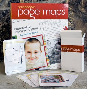
We all have those days when our creativity seems to be missing. For me, I always turn to sketches to start the creative juices going. I recently purchased this book called Page Maps and I am absolutely in love with it.

It's quick and easy to use and I love the fact that it lays flat so that it stays on the page you chose. The portable "Deck of Card" sketches are great to cause I throw them in my bag and take them to work so I plan out a layout on my lunch break if I want to.

I used to think using sketches were cheating but I have quickly found that they are a great inspiration tool. Some times I follow the sketch to the T and then there are times whenI switch things up like turn the sketch on it's side or upside down or embellishments to make it my own. I find it's very helpful when I feel I am blocked.

They also have a website and if you sign up for their newsletter, once a month they will send you their mothly sketches for free. http://www.pagemaps.com/

Oct 1, 2009

An Ingenius Idea

As I stated yesterday, I have the daunting task of sorting through the hundreds of photos I took while overseas. Well, I was talking about this with the owner of my local scrapbook store and she recommended this great product that makes scrapbooking a lot of photos easy and fun. Unfortunately, she doesn't carry it so off to Goggle I went and guess what I found it! I ordered it immediately and I can't wait for it to be delivered! This is what I bought (on top of a couple more items that shall remain nameless), it's a 6 Up - 4x6 Inch Photo Sleeve.

You can fill each pocket with a photo and then maybe leave 1 or 2 empty. Then in those empty spots you can cut a piece of cardstock to 4x6 and write your journaling on it and embellish it anyway you like, just like this example I got from Becky Higgins' blog. It will be way more economical than doing a layout for each photo. Just think about it 10-12 pictures per 2 page spread ... that's pretty awesome. I am still planning on creating reqular layouts that will be intermixed with these 6 Up pages. i think it will turn out really cool. Once I get the package delivered you can bet it won't be long before I am doing a post showing you just how cool it is :)

Sep 30, 2009

10 Years Ago

Here's a layout I did just before we went on vacation. The photo was taken 10 years ago when Steve and I took our first vacation together. Boy do we ever look young :) We took a road trip to Ontario and this picture was taken on the White Water Rapids Ride at Canada's Wonderland in Toronto. It was a lot fun and we made lots of memories. It's so hard to believe that 10 years have passed since then. Once again, where does the time go?


The paper I used is from one of my favorite Cosmo Cricket's collections called the Early Bird. I posted about this collection when it first came out and I had been hoarding it, waiting for the perfect pictures to user it with. The letters I used were some old chipboard letters I had kicking aroud that were the wrong color, so I painted them using Ranger's Crackle Paint and I love how they turned out!

Jul 8, 2009

Decorating Eggs

Here's a layout I did of my niece decorating Easter eggs and if you look to the right of the layout you'll see color blocks. Those are actual paint samples from the local hardware store. I thought it tied into the whole painting the eggs theme plus I was able to find exact color matches to my patterned paper. So the next time you are at the hardware store stop by the paint sample board and grab some color samples in what ever color catches your eye. I can guarantee that if you like the color, you probably already have patterned paper in your stash that will work with it.

Jun 26, 2009

Simply Beautiful

Here's a layout I recently did with a picture I took of my brother and his beautiful fiance in Kananaskis Country. I really felt that this picture captured the love between these two and I wanted to do something special with it.


I chose an appropriate themed paper - lovebirds and went for the layer look with my matting. I really like the layered look as it allows me to use different patterned papers in similar/complimentary colors from my leftovers pile. I recently purchased a new stamp set and found this layout the perfect place to use it. So I stamped the boy and girl in blue on the layout. I liked it but I thought it was missing something. I then remembered that I had these little adhesive pearls I bought a while back and thought they would work out great so I used them as buttons on the boys shirt. I then thought the girls dress needed something. I found these rhinestone shapes (hearts, flowers, stars, etc) at the local dollar store on one of Catherine's and mine shopping sprees and decided they would be perfect. In the center of the flower I stuck one of the pearls to pull it all together. Bling, that was it! I love how this layout turned out and came together really well. And the bonus to it all, everything with the exception of the stamp set I already had in my stash! How awesome is that! Yes I know, my stash is quite extensive so really it wasn't that hard.


Jun 18, 2009

Hanging Out


We spend hours and hours creating the perfect layout, pouring our heart and soul into everything from the photos chosen to the bling pain stakingly applied and then what do we do? We put it in a Album to be pulled out every once in awhile to be looked at.

Well I saw this idea and thought it was totally awesome - display your hard worked on layouts as pieces of art in a gallery. To get this look simply go to any local store (Walmart, Ikea, etc) that sells curtains and rods and buy curtain rod and loop clips. Remember the longer your rod the more layouts you can clip up. Mine is the length of the couch and I can fit five layouts on it easily. Hang the rod somewhere in your house where it can be seen and enjoy. Just remember that sunlight fades paper so either hang the rod where it doesn't get direct sunlight or switch out the layouts very regularly.

I love this as it allows me to display favorite layouts, recently completed layouts, or themed layouts (like Christmas ones at Christmas time) as decoration. I think it is so clever!

Jun 17, 2009

Papparazzi

I have a new technique that am absolutely in love with. I'm not sure what it's called so I call it fraying :) I use it on a lot of my photo mats to give a little bit of a messy look and I love the dimension it adds to the photos. Here's a layout I used it on.


And here's a close up of the photo mat (the teal mat) that I used the fraying technique on.

So I guess you are wondering how to do this cool technique, well it's really quite simple. I will warn you though that it is messy so make sure you do it over the garbage can. Now there are little tools out there that you can buy but I find my scissors work just fine plus I can control how much fraying I get based on how hard I press with the scissors. First thing you do is cut your photo mat to size you want. Next you take a pair of sharp scissors and open them all the way. Then hold the scissors at the swivel point with the blades facing away from you. Place the top blade at a forty-five degree angle to your photo mat. Drag the blade of the scissors in short strides down the photo mat working towards yourself. You can keep going over the same spots until you get the desired look you are aiming for. I recommend trying this a couple of times on a piece of scrapcard stock until you are comfortable. I hope you have fun getting a little frayed just like me.

Jun 15, 2009

Water Dog?

This is the sketch I have decided to use for the Pictures I took of Angus the first time he played in the water. I love how the background looks like waves.


I also took this opportunity to play with one of my new favorite paper lines - Snorkel by Cosmo Cricket. I modified the sketch as I needed it to be a 2 page layout. I love how it turned out so much that I think I might just submit it to Cosmo Cricket for their use. We'll see.

May 29, 2009

Angus the Water Dog?

If you know my dog, you know that he hates the water. While other dogs play and jump in the water, Angus stands on the edge of banks with his paws right at the edge and barks until the other dogs come back in to play with him. It's been this way for years. Well, after 7 years of existence, Angus has decided that maybe it isn't so bad. What?! I know it's hard to believe but on the May long weekend we were camping in Kananaskis with Family and we took Angus and my brother's dog Timber down to the river to play. Timber loves the water and was in it in a heart beat. Angus did his usual and stood on the bank barking. After a couple of minutes of Timber still playing in the water and not coming back in, Angus decided to take a step into the water, only covering the tops of his paws though. He continued his barking but Timber ignored him and continued playing. Next thing I knew Angus was up to his belly! I was so surprised and excited that I almost forgot to take a picture. Can you believe it. I was so proud of him and I think he had a great time. We'll have to wait to see if he will do it again or if he will revert back to his old habits but one things for sure, I'll have a lot of fun scrapbooking this one.

Tree - rrific Layout!

I've been hard at work on my friend's wedding scrapbook for the last several weeks trying to get it done. The finished product is on the horizon, yippee! I have really like how it is turning out and I hope she likes it too. Here's a couple of shots of my favorite layout. I absolutely love it, especially the tree.


I created the truck of the tree by ripping to top and bottom cover sheets of a cardboard box and stitched a little heart in the truck ... Love It! Then for the leaves I cut multiple circles out of different patterned paper in different sizes. Some I adhered right to the background and some I used pop dots under them to raise them up. I then added a couple of buttons and some brads and tada! Doesn't it look awesome!

May 5, 2009

New Obsession

For the last year I have had two go to manufacturers that I seemed to use for a lot of my scrapbook papers: My Minds Eye and Basic Grey. Although, there are still tops with me, there is another contender coming up the ranks rather quickly - Cosmo Cricket. Have you seen their lines? Abosultely fabulous! I'm not sure how I have missed them before this. One thing that I love about their product lines is it comes with everything from paper to rub-ons to ribbon to chipboard.

Their new line just coming out now is called Early Bird and I love it. It reminds me of my grandmothers. I can't wait for it to hit the selves so that I buy some of it.


Another one of their lines that I absolutely love is called Mr.Campy. It came out in the fall I believe and I had to scour high and low to find some this for myself. I am going to for sure use this for the pictures I take this summer while camping.


And speaking of summer, isn't this line called Snorkel absolutely awesome! As soon as I saw it I had to buy it. It'll be great for all the water related activities we'll do this summer or even for when we go to the Domincan Republic in Feb 2010.


If you want to see any of their other lines you can go to the Cosmo Criket website. Have a great day!

Apr 14, 2009

Ooo ...

After 10 years of scrapbooking, I finally got up the nerve to submit one of my layouts for a contest thanks to some encouraging from Catherine. The contest is a sketch contest from Page Maps.

The prize is a boat load of My Mind's Eye products, which is one of my favorites product lines; in fact this whole layout is done with it! If I happen to win I will be getting a COMPLETE set of their Penny Lane collection that includes over 40 sheets of cardstock papers and cardstock die-cut papers, transparencies, die-cut shapes, frames and titles, rubs and stamps ... woozers!

This is the Sketch we had to work with:

And this is my interpretation of the sketch:
I admit a lot of work went into this layout. All the stitching was done by hand, I frayed the ribbon my self, inked all the pieces, sanded the picture and title edges, and flocked the tree branches I cut with my cricut. It was a lot of fun do even though it took me quite a bit longer than most of my other layouts take. Here's some close up shots for you:

Mar 16, 2009

And the Magic Number is 32!

32 Pages completed this weekend ... can you believe it?! Well, they're almost completed. There's just a litte bit of journalling left to do and then I can say they're completed but that's pretty amazing.

This weekend I went away with my good friend Susan to a scrapbook retreat in Canmore and I had an awesome time! All the girls there were so much fun, the food was fantastic, and I got so much accomplished! We booked ourselves in for another weekend in May and I am so looking forward to it.

Once I get some of the layouts finished up I will post my favorites. Have a great day!

Mar 10, 2009

Though the Years


Have you ever had an embellishment that is perfect for a layout but the color is slightly off or it looks too new for your vintage vibe? Boy do I have the solution for you.


I was looking for some numbers in order to put the year of my car on this layout. I didn't like the ones I had, the colors were a little too bright so I sanded them down a little bit and then rub some ink on them in more desirable colors. I love how they turned out, they look a little aged just like my car.

I also sanded the metal circle embellishments so that they didn't look so new and this brought out the silver background of the embellishment.
I hope this helps you with your future layouts.

Feb 26, 2009

Fontastic!

It's hard to believe but yes some things in life are free. I got a new laptop this year and when I switched from my old one to my new one I lost all my nifty fonts I had collected over the years that I use when typing up my journalling. Well guess what, I found website that has over 280 different fonts that are completely free and available for donwload. You don't even have to create a login account to get them. How awesome is that?!

http://www.urbanfonts.com/

So needless to say I have spent the last several days downloading almost every one and I am in the midst of slowly installing them on my laptop. If you have never done this before it is pretty easy.

1. Download the WIN verson of the font and save it some where you will remember
2. Find the folder you downloaded and double click it to open it
3. The file will open in a zip program, extract the files. You should now see them in the same spot as where you downloaded the zip file to.
4. Copy the font file. This will be the file that ends with .tff. You do not need any other files.
5. Go to C:\Windows\Fonts and paste the file there
6. Once the copying is done, you are done installing that font.

See wasn't that easy? Now you will have access to that font in almost every program you have on you computer (ie: Microsoft Word and Adobe Photoshop)

Happy Journalling!

Feb 6, 2009

Scrap - Palooza

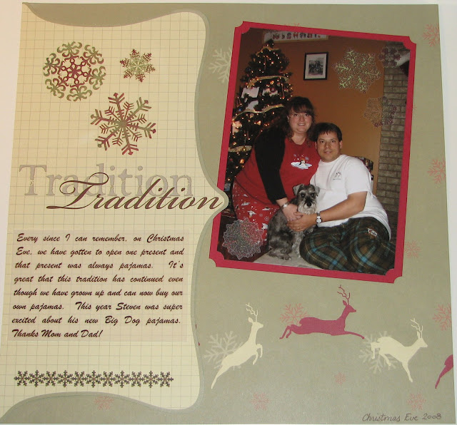
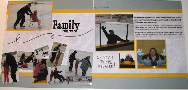
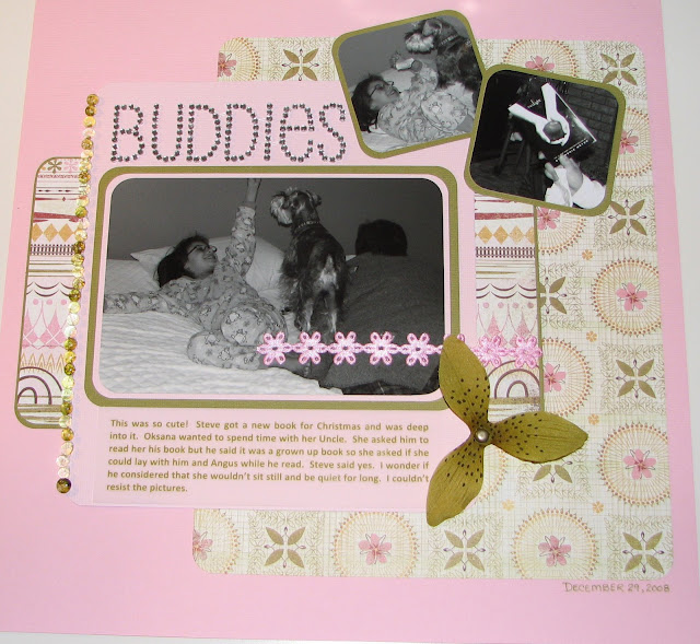
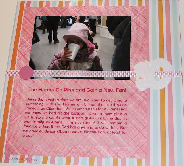
Last weekend my friend Susan came down for a visit and to scrapbook all weekend. My focus was Christmas '08. I can't believe I am so up to date. I guess that means I should get back to everyone else's books and update them too ... it's just that it isn't as fun as my own stuff.

Here's some of the layouts I did, I will post more once I finish them. I think my favorite out of all of them is the Skating Rink one. I love how it came together plus everyone's silly faces.


Feb 3, 2009

Chez Jen

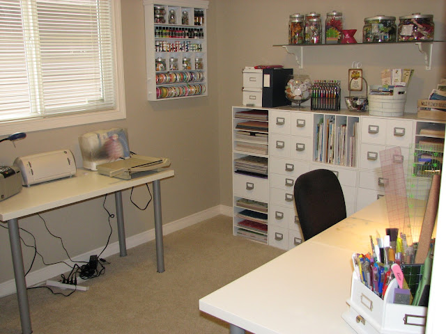
Here's a picture of one of my favorite rooms in my house; my scrapbook room.


One of the best parts of moving is that I actually have a scrapbook room now, instead of an unfinished corner of a dark basement. I'm sure once kiddies come along, I will be banished back to the basement again but until that time I am enjoying this.

I got new tables for my scrapbook room after my old table became an unfortunate victim of a scrapbook weekend. They match my storage cubes and I am so happy with the final look. They were a really good deal, both for $140, although I need to save a couple more pennies to get glass tops for them in order to protect the finishes.

Jan 20, 2009

New Features

Well I hope every one's holidays were memorable ones. Mine were with the exception getting the flu.

It's been a little slow getting back into the swing of normal life without Christmas parties and Christmas goodies around every corner. I have been busy getting some ideas for my next set of pictures to scrapbook which has lead to a new addition to the blog: My Favorite Scrapbooking Blogs & Websites. Here you will find links to a lot of the blogs and websites I surf when I am cruising for some inspiration. I also added a little area where you can quick click to get to the sketches based on the number of photos you are trying to scrapbook. I am hoping in the next couple of days to get some more of my favorite sketches up there for you to play with so hang in there!