Jun 30, 2011

His Happy Place


Isn't this line from My Mind's Eye the cutest!  I love it!  I know for a layout about husband's computer area it is a little juvenile but I thought it worked good with the techie theme.  I love all the co-ordinating embellies that came with this line.  Aren't those brads the cutest! 


Because this was a one photo only layout I gave the photo a triple mat to make it seem more substantial.  I also wanted to tie in a bunch of colors so this worked great for that.  See the white mat?  I actually ran it through my CuttleBug using the Dot Matrix embossing folder, which I thought was very fitting for this layout!

Supplies: Patterned Paper: My Mind's Eye - Lil' Robots Collection; Cardstock: Bazills; Alphabet Stickers: American Crafts Thickers; Embellishments: My Mind's Eye - Lil' Robots Brads and Cosmo Cricket - Cogsmo Rubons; Tools: CuttleBug, Tim Holtz Dot Matrix Embossing Folder, Tim Holtz Tiny Attacher and Fiskars Large Circle Squeeze Punch.

Jun 29, 2011

Good Bye Cuba

And this is the end of Cuba! I am so happy to be done this book! I know so many scrappers follow the philosophy of I scrap what I want not chronologically but I can't work that way. It's a personal preference. I find if I don't do it all at once, I won't come back to it. I know this because I tried it once. It's like my stash pile ... if I don't use it right away it will sit for a long time and I have to really challenge myself to use it. And so I stick with chronological scrapping. This nice part is I am usually no more than a year behind!


I have been on a use up old supplies kick lately and for this layout I was determined to use some old prima flowers I have had kicking around for quite sometime.  Even with this many flowers on this layout, I still have a full jar left!  I think I might have to do this more often if I want to make a dent in that stash!  Do you have any neat ideas for using flowers you would like to share?


Supplies: Patterned Paper: Fancy Pants - Road Show Collection; Embellishments: Flower, flowers and more flowers, Brads, Pearls, Beads, Ribbons, and Stickers; Inks: ;Glimmer Mist and Tim Holtz' Distress Ink; Tools: Cropodile, Creative Memories Corner Rounder, and EK Success Dotted Scallop Border Punch.

Jun 28, 2011

Cuba 2010

I have everyday albums that house my layouts about our day to day lives but our vacations get their own albums.  The reason for this is most people when they visit want to see you vacation photos and not necessarily the photos of my new shoes or my husbands current obsession.  Also, I usually go crazy with the amount of photos I take on vacation that the layout need their own album (or two or three)!  Because of this, each of the albums get their very own title page that basically say the location and the date and sometimes if I have some memorabilia (I don't in this case) from the trip that never made it onto a layout.


Supplies: Patterned Paper: Basic Grey - Urban Prarie Collection, Echo Park - Walk in the Park Collection ; Cardstock:Bazills ; Embellishments: Tattered Angels Bingo Card, My Mind's Eye Transparency Butterfly and Memories Ticket, Pearls; Inks: Tim Holtz - Distress Ink.

Jun 27, 2011

300th Post Giveaway Winner

Thank you everyone for your kind comments on my 300th post!  I think I am a lot like many of you where I do themed layouts spuratically as the inspiration hits me and other times it's just what I feel like doing.  So without further delay I would like to annouce the winner of the Giveaway ...

Congratulations Amanada (OkanoganGirl)! 

Please send your snail mail information to me at jenniferdewolfe at gmail dot com.

Thanks again everyone and I'll be back tomorrow with another layout for you!  Have a great day!

Jun 23, 2011

Jeep Expedition + 300th Post Giveaway


I love this layout!  It was so much fun to make!  I totally went for the theme with this one which worked out perfectly.  Last week, my order of Sketch Books from Scrapbook Generation came in and I was so super excited to start using them!  This layout was based of a two page sketch out of volume 1 where I just used the left page of the sketch. 


I wanted the layout to have that true off road feel so I went to a toy store and bought a little toy truck (this is when I wish I had kids that I could borrow the toys of) and then ran the tires through some brown paint and then across the bottom piece of patterned paper.  It was not as easy as it sounds though and it took many attempt to get it close to what I liked.  The paint would run off the tires before I got to the end so I would have to stop half way, reload, and continue on.  Good thing for the photo which covers up some of the blunders.  Next I took the same paint and put a couple of dabs of paint in a mini mister, filled it with water, shook it well, then misted the entire background paper.  I then stuck an old tooth brush in some watered down paint and then splattered it with my finger tip to get the bigger blobs.  Using what paint I had left on my tray, I painted the edges of all the patterned squares and photos to tie them into the theme.  I think it turned out awesome!


As I stated in the title, this is my 300th post!  Yippee!  I thought I would celebrate by having a giveaway of some very fun scrapbooking goodies!  That sounds like fun doesn't it!  To win, simply comment on my blog telling me if you theme scrapbook or not and if you do what's your favorite theme to do.  I will also be giving you a double entry if you are a follower, so if you aren't one be sure to become one!  I will pick a random winner on Monday morning.

Have a fantastic day!

Supplies: Patterned Paper:Bits and pieces from my scrap pile ; Cardstock:Bazzils ; Alphabet Stickers: American Crafts - Thickers; Embellishments: Tim Holtz's Grungeboard Shapes and Ideology Gears, Making Memories Brown Paint,  and a couple of embellishments from my stash,  ;Sketch: Sketches for Scrapbooking - Volume 1.

Jun 22, 2011

Sweet Ride


I struggled with this layout.  I started it about 4 weeks ago without any plan on what I wanted and then it sat on my desk waiting for me to finish it up since then.  I wasn't feeling inspired with it.  Don't get me wrong, I love these photos.  We had so much fun while they were being taken and I had so many to choose from.  I followed my own advice and picked my favorites but the problem I was having was the paper choice.  The background cardstock was originally a greeny-blue and I didn't like it.  So last week I decided to rip it apart and redo it with a blue background.  I was happier but still not satisfied.  I found the layout plain.  So I border punched the edges and then added the bling in each circle.  I liked it more but found the bling seemed random so then I went bling crazy on the title.  I think this helped to tie it all together.  Still not my best work but it's what happens when I don't start with a plan!


Supplies: Patterned Paper: Bella Blvd - Mr Boy Collection, Echo Park - Walk in the Park Collection, and Tinkering Ink - Beloved Collection; Cardstock: Bazzils; Alphabet Stickers: American Crafts - Thickers; Embellishments: Bling, Ribbon, and Buttons; Tools: EK Success Large Circle Border Punch .

Jun 21, 2011

Such Nice Guys

Happy first day of Summer to all you in the northern hemisphere!  I am so looking forward to the long, warm summer days!  I am an odd duck and winter is normally my favorite time of year but this year I am so excited about summer being here.  I figure it's because this is the first year in many (since 2004) that I haven't had to do any landscaping!!!  I am so looking forward to kicking back in my backyard, enjoying a cool drink and admiring all our hardwork!


I absolutely love how this layout turned out!  I struggled a bit with my color choices by it quickly came together when I found several papers from an old Martha Stewart Scrap Pad I had laying around.  They work perfectly with the pictures don't they?!  The only thing I am regretting is the yellow flower brads.  After I had them in place I had a D'oh moment and thought I should of used rain drops instead!  Oh well!


I love this cute little umbrella that was a last minute add.  I cut out a circle in my patterned paper and them cut in in half.  Then using a border punch I punched along the flat side to give it the scalloped look.  I then added some stitching and a button to the top.  The handle was a pin that I threaded some beads on and then added underneath the umbrella top.  Turned out perfect if I do say so myself!

Supplies: Patterned Paper: Martha Stewart - Essentials Paper Pad ;  Alphabet Stickers: American Crafts Thickers; Embellishments: Brads, Pearls, Beads, Embroidery Floss, Ribbons, and Buttons; Tools: EK Success Scallop Border Punch.

Jun 20, 2011

The Joys of Technology

Hello Friends! I know it has been a little while, but I have a valid excuse ... really! You see, my work supplies my laptop for me and every two years I get a new one (yes, it's great to be a computer geek!) and all though it is always great to get a new laptop, the time it takes to set up a new one is unbelievable! To make matters worst, the day I got my new laptop, my old one got a virus and boy was it a doozie of a virus. If only it had wait a day for me to get all my data off it first but no it did not! So I had to spend two days rescuing my old laptop in order to move all my stuff to the new one. A week later and I think I am done. So I apologize for my absence and I promise to back with regular scrappy blog posts this week!

Until then, here's a card I made to send to a friend of mine who got married this past weekend. See you soon!

Jun 15, 2011

30


It's my great Aunt's 30th wedding anniversary and I thought it would be nice send them a card.  Nobody seems to celebrate anniversaries anymore I find.  I think that is sad seeing as it is something that should be celebrated!  I'm sure she will appreciate this small token that shows we were thinking of her ... I know I would!

Supplies: Patterned Paper: Basic Grey - Koshi Collection; Cardstock: Bazzils; Alphabet Stickers: American Crafts Thickers; Embellishments: Ribbon, Felt, and Button; Inks: Colorbox Chalk Ink; Tools: CuttleBug, Swiss Dots Embossing Folder and Nestabilities Holiday Cheer Dies .

Jun 13, 2011

Hip Hip Horray


This past week was one of my co-worker's birthday and the two of us have been working together for over 8 years.  He keeps trying to throw me off his birthday scent but I always remember!  I wanted to make him a card but I alway struggle with cards for guys.  I want them to look masculine but some how that is hard for me without putting power tools or race cars on it.  I don't mind how this one turned out (although in the picture it looks more pink then red); I like the simplicity of it.  I tried to stick to what I consider guy patters (grids, stripes, and dots).  How do you make guy cards more masculine?


Supplies: Patterned Paper: My Mind's Eye - Bohemia Collection, Cosmo Cricket - Mr Campy Collection; Cardstock: Bazzils; Embellishments: Ribbon and Stamp; Inks: Archivers Ink - Black.

Jun 9, 2011

Good Times


As a gift for being a Guest Designer for Sketch Support in the month of April, Allison sent me one of Sketch books.  I was so excited when it finally showed up.  There's actually a funny story there.  The book accidentally got sent to my neighbours address instead of mine.  I came home one day to it being on my doorstep with a note from my neighbour.  Apparently, she sent an email to Scrapbook Generation trying to figure out where the book was supposed to go and Stacey, Allison's sister, clarified things for her.  I had to giggle when I read her note.  We've been neighbours for 3 years and chatted numerous times but I guess she never knew my last name and when the package showed up she didn't put two and two together that the Jennifer on the package was the Jen (as most people know me) across the street.  Too funny!  So when I did finally get this sweet little book I immediately took to creating a layout from one of the sketches.  I actually liked the book so much that I ordered the rest of the volumes.  I sure hope they end up at the correct address this time but if they don't, at least my neighbour knows where to find me if they show up there!


Supplies: Patterned Paper: Fancy Pants - Road Show Collection; Cardstock: My Mind's Eye Kraft Paper; Alphabet Stickers: American Crafts Thickers; Embellishments: Ribbon and Brads; Sketch: Sketches for Scrapbooking Volume 7.

Jun 8, 2011

A Sister

Isn't it great when someone joins your family who you really connect with. That is the case with my sister-in-law. She's such a sweetheart and I thought this picture of the two of us on her wedding day was too perfect not to dedicate a layout to our new sisterhood!


This layout started out with the background paper which I was saving for this picture because the colors were perfect.  From there I just keep pulling things out of my stash to go with it.  I started out with the chipboard flower and it grew from there.  I love the resin flowers by Prima so that go added and then I had the cutest crocheted flower that needed to be included.  I also wanted to add the blue flower but need a center for it so I took a piece of ribbon and loosely tied it into a big knot and used that as the center.  I think they turned out awesome!


Supplies: Patterned Paper: Tinkering Ink - Beloved Collection; Embellishments: My Mind's Eye Sister Die Cute, Various Prima Flowers, Prima Resin Flower, Ribbon Glossy Accents, Beads, Pearls; Tools: CuttleBug, Nestabilities Oval Die .

Jun 6, 2011

Sketch It To Me Blog Hop Winner!

First off I wanted to say thank you to everyone who left such wonderful comments on my blog this past weekend!  I had so much fun participating in this blog hop and really enjoyed working with the sketch to make my layout and card.  I'm sure you are all wonder who won the giveaway so without further ado I would like to annouce the winner of the Echo Park Paper is:


Congratulations Beth!  Please send your mailing info to jenniferdewolfe (at) gmail (dot) com and I will get it into the mail this week!

Jun 4, 2011

Sketch It To Me Blog Hop - Part 2

I feel like such a bone head! I was checking out the other blog hoppers Sketch It To Me posts when I realized I never posted the card I made from the sketch with my post yesterday! Seriously ... what a bone head! So I apologize for missing it and here it is!


For this card I basically used the photo mat section of the sketch to make my card. Instead of photos, I used pieces of left over Echo Park paper from the layout I posted yesterday. I loved this paper so much that I couldn't bare to throw any of it out! See that adorable little house, I made it out of pieces of felt! I'm sure my wonderful neighbours will love this card when I give it to them!

Have a great weekend and don't forget to read yesterday's post for how you can win a paper pack from Echo Park!

Supplies: Patterned Paper: Echo Park - Walk In the Park; Cardstock: Bazzils; Embellishments: Felt, Embroidery Floss, and Basic Grey - Bling Crystals; Sketch: Amanda Sherman; Tools: Dymo Embossing Label Maker.

Jun 2, 2011

Sketch It To Me Blog Hop

Hello and welcome to the Sketch It To Me blog hop. I am so excited to participate and would like to Thank Amanda for letting me join! I am the last stop on the blog hop and you should of arrived here from Dana's Blog, but if you didn't you can go back to the beginning and start at Amanda's Blog .

Amanda gave us this great one page sketch to work with.  We were allowed to interpret it how ever we please so I hope you enjoy my interpretation!


This layout is about my dog Angus. He loves to go to the dog park and play with the big dogs. I personally think it because he thinks he is one too! I cho0se this paper by Echo Park because I love all those trees and thought it fit my dog park theme very well.


So in case you didn't notice, I did do some changes to the sketch.  The biggest change I made was to the photo block.  I rotated it 90 degrees clockwise as it fit my photos much better.  I also shifted everything up slightly so that you could see a row of trees on the bottom of the layout.


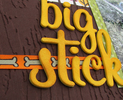
I also switched up the border strips a little.  Because my background paper was so busy I wanted my strips to have a calming presence so I used brown cardstock and ribbon.  To give my cardstock a little texture and to make it fit better with the park theme, I ran it through my Cuttlebug with a Tim Holtz embossing folder.  I tried the title above the border strips, as in the sketch, but it got lost up there.  So I moved them down slightly onto the border strip where they had a better chance of standing out.  I also added a little bit of ink onto the foam letters to tone down the yellow slightly.


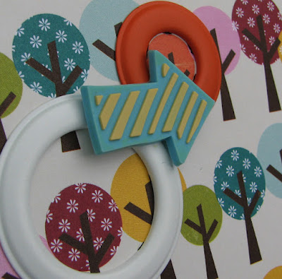
The sketch also had some die cut circles which I replace with these cute little rings that I have had in my stash for as long as I can remember.  I think they were made by Making Memories many, many moon ago!  On top of them I added some gummie embellishments by Love Elsie.  So cool aren't they?!


And that concludes my portion of this hop.  I sure hope you enjoyed my post and all the posts by my fellow hoppers!  On behalf of us all thank-you for joining us!  In fact, as a thank-you, I would like offer a giveaway!

That's right a giveaway!!!

Simply comment on this post and become a follower of my blog and I will randomly draw a name to win an Echo Park paper pack on Monday!  I hope you have a wonderful weekend!

Supplies: Patterned Paper: Echo Park - Walk In The Park Collection; Cardstock: Bazzils; Alphabet Stickers: American Crafts Thinckers; Embellishments: Ribbon, Making Memories Rings, Love Elsie Gummie Embellishments; Inks: Chalk Box; Sketch: Amanda Sherman; Tools: CuttleBug, Tim Holtz Woodgrain Embossing Folder.

Jun 1, 2011

A Beautiful Day for a Walk Down the Aisle

I guess I have been MIA lately. It seems as though time is flying by ... is it really June already!?! It happens around this time of year, I loose my scrapbooking mojo. I think it has to do with the fact that nice weather has finally shown up and I have been busy planting my garden, camping, having BBQs, and generally enjoying the great outdoors! You see, winter here is way too long and summer flies by so fast so I try to enjoy every minute of it! So please excuse me if my posting seems a little sporadic in the next little while but I just can't miss my 2-3 months of nice weather!


This is yet another layout about my brother's wedding. I know you must be getting tired of them, I know I am and can't wait to finish this album. It's not that I don't enjoy these pictures but I have some other photos I have promised myself I won't start until I finish this album. I am almost done, the end is within sight! I am finding the last couple of layouts hard to do though. It could be because I have used all my cool ideas already ... who knows. Do you find that when you are doing an album dedicated to a single event that is always hard to finish those last couple of layouts?


A while back I was big into those Bling It On Crystals by Basic Grey.  I think I have every color imaginable!  Lately they have fallen out of favor on my layouts but I decided to bring them back for this layout.  I used them up pretty up the flowers and to add some whimsy to the journalling spot.  I guess I can scratch another use an older item on my layouts off my list!


Supplies: Patterned Paper: My Mind's Eye - Quite Contrary Collection; Alphabet Stickers: American Crafts Thickers; Embellishments: Ribbon, Basic Grey Bling It On Crystals, and My Mind's Eye - Quite Contrary Accessory Sheet; Tools: Dymo Label Maker.