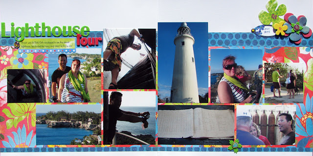
Sometimes it is so hard to scrapbook vacations. There always seems to be either too many or too few (that's a rarity for me if I am honest) photos to do what I want with a layout. This layout was a little hard for me. I had tonnes of photos and as you can see I had a hard time narrowing down which ones to use. I always start with my favorites but sometimes (like in this case) I had 15 photos I liked, yikes! I managed to weed out 5 more based on which ones I could crop and fit on the page but I always feel bad about the ones I leave out. I am curious about all of you. How do you weed out photos? Do you every find you take too many? What do you do with the extras (if anything)?
Because I had so many photos, it left very little room for journalling. I managed to find a long rectangular journalling spot and decided to tuck it in with the title.
I also managed to stick another little journalling spot on the top right with the flowers where I could put the date the Lighthouse was built. Sneaky I know!


2 comments:
Nice! You always have everything in the right place!
Brilliant use of multiple photos and bright patterns! I love your execution, this page just makes me happy (and as usual - I love your title ;) )
Post a Comment