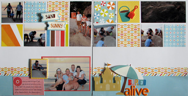
Ok so I think I am getting the hang of this using scraps thing ... not to brag or anything. I had a bunch of odds and ends left over from my two other layouts I did with this collection from Echo Park so I looked for a sketch that used a bunch of little pieces instead of long or wide pieces. I found one in my Sketches for Scrapbooking books that had little squares along the top which was perfect. And the joy of double sided paper is that I could cut two squares out of one sheet! I had a couple of photos that I couldn't crop down to the square size so I made them span two squares instead. Took a little bit of math and measuring but I made it work!
I struggled a bit with the bottom of this layout though because I found there was so much white space and if I see white space I like to fill it. I used a couple of the element stickers which helped to fill the white space and anchor my title to the layout but to me there seems to be more I could do. But I listened to my croppin' buddy and left it alone so it is done, although I keep thinking there is still room for more! I will admit though that I do like the multicolored title!


1 comment:
I think it looks great - what a great idea with the squares! And I'm like you with too much white space, it doesn't seem finished! I think you have enough but not too much.
Post a Comment