It's one of the days of the year that I looked forward to ... a day of uninhibited, deal grabbing, mayhem dodging, line standing shopping! I get so wrapped up in it! We start planning for the madness and mayhem early; deciding which stores we want to go to at what times. It is so much fun! This past year was our 5th year of Black Friday shopping in Great Falls, Montana and it was just as much fun as the first! The irony in all of this is in Canada we have a similar day called Boxing Day (right after Christmas) and I haven't set foot in a store on Boxing Day in years. Many people I tell that too thinks it's hilarious that I will drive 4.5 hours to go to Black Friday and but 4.5 minutes to go to Boxing Day ... I know it makes no sense to me either! But needless to say I am already looking forward to this years trip!
I was so excited when I came across a refill roll for my Dymo Label Maker; it's become really difficult to find! I'm kind of wishing I had bought more because after a couple of layout, I am already out of black! Sigh, maybe I will find it again.
Showing posts with label Photo Count: 2. Show all posts
Sep 17, 2012
Sep 13, 2012
Geeks Don`t Workout They Upgrade
This title makes me laugh! I wish I could take credit for it but I can't. My hubby used it as his tag line when he posted these photos on Facebook. So when I printed these photos I already knew what my title would be! I love it when I have photos that already have an idea for. It sure makes a layout very simple! I tried to this layout very clean and minimal because it want it to have a masculine feel and look! Please ignore my horrible grammar in my journalling. Why is it I never notice these things until I blog about it?!
Aug 20, 2012
Swim Up Pool Bar
We have always wanted to try a swim up pool bar. The concept sounded so cool but none of the resorts we had ever stayed at had one until this trip. I was excited. I'm not sure why really but it sounded fun! After now having tried it, I can't understand what I was so excited about. First off it is impossible to sit on a stool in the water. I kept falling off mine and no it was not because I had too many margaritas! When I was a kid I remember spending hours trying to sit on a floatie in the water and always kept falling off no matter how hard I tried. Well this was much the same thing. It was definitely an experience, one I am sure I won't be so eager to try again ... I will take my margarita sitting in a beach lounger instead!
I decided to break out my circle cutter for this layout. I haven't used it in years! I remember when all my layouts had circle and oval photos or even squares cut out with fancy scissors. It just seemed that it was a phase that I grew out of. But this layout I had two photos I wanted to use but the one of Steve was mostly pool so by the time I cropped it, it was a weird size and didn't work with my layout. Then I thought hey why not make it round and I did and it looks great! And because it was so cropped I had space to use another Status Update post it note ... I love them!
Aug 16, 2012
Group Snapshot
Awhile back I won a stamp set from Swiss Girl Designs. She has some of the cutest stamp sets! In fact, when Rahel told me I had won a set I took the opportunity to purchase a couple more to be sent with my winning set. This was my first layout I did with my new stamps and I love them. If you are interested in her sets visit her site at http://swissgirldesigns.com/. If you have time while you are there, look through her blog, she is so inspiring and she even does some really awesome how to videos set to her hubby's music!
I also stepped it up a bit and did a little bit of fussy cutting. I really liked the flowery background paper in this collection but I found it really over powering. So I cut out a small section, as well as a couple of butterflies, and then tucked it behind then placed it so that it looked like it was peaking out from behind the photos.
| Supplies: Patterned Paper: American Crafts - Margarita Collection; Alphabet Stickers: Old Chipboard Letters; Embellishments: Margarita Stickers, Swiss Girl Design Stamps; Inks: Colorbox; Tools: . |
Jul 23, 2012
Where the Sun Shines ...
I think one of my favorite parts of scrapbooking has to be title construction. I'm not sure why? I just really like it. I think it might be because I have an issue with doing a title in all one font and colour. It needs to be more eclectic than that for me. I get to pull out my stacks (and I mean stacks) of Thickers and Letter Stickers and then play around with colour and size combinations. Of course there is always the challenge of finding all the letters you need to spell a word which can be a little frustrating but for the most part it is enjoyable. So on this layout I really like how my title takes up the while left side. Makes a really big impact if you ask me. Plus I got to use four different types of alpha fonts!
I kept the smaller text all one colour and type just to keep it consistent and allow the bigger accent words to stand out!
Apr 23, 2012
Winky the Wonder Dog
I love how this layout turned! I think it's the title. The orange puff letters and the talking bubble make me think of a comic book which is so fitting of my little guys newest nickname.
I wanted the talk bubble to have a more distressed look so I tried inking the edges with my regular ink but because it had a glossy finish, it would smear right off as soon as you touched it. Then I decided to use my Archivers ink which is designed to work with glossy surfaces and although it was a little more tricky (I'm not patient when it comes to waiting for stuff to dry) to use I think I got the effect I was looking for
Apr 19, 2012
Val and Shane's Wedding
A while ago, my neighbour approached me about making a wedding album for him to give his wife for their 5th wedding anniversary. They both have been over and seen someof my album and they both "love my mad scrapbooking skills" (hahaha) and he thought she would love their wedding album done. So how could I say no after so many compliments! Once again, I used supplies I already had in my stash so it was a great stash buster and the bonus is the money he has given me to cover my costs gets to go towards new stuff!!! Sneaky I know but would non-scrapbookers really be able to tell the difference between product release this year and a couple of years ago? I didn't think so either! So here's a couple of pages I completed for their album.
Mar 14, 2012
Best of Friends
Whoop, whoop! Another layout created using scraps! Excluding the background paper, everything on this layout was made from my scrap pile. Hard to tell isn't it!
After I chose my scraps to make my blocks I noticed that two of the blocks (top right and bottom left) had only one colour in the pattern and for some reason that way throwing off my layout mojo. So I decided to add another colour! I took out some of my favourite acrylic stamps and some ink and stamped a pattern on to each of the blocks. Almost looks like they came that way! Now I am happy as it seems to go together better! So if you ever find a piece of paper isn't working for or that a colour is missing from an otherwise perfect pattern why not give this a try! You never know ... you might create something you love too!
Sep 12, 2011
Hardest Day of Our Lives
As scrapbookers, we always tend to scrapbook family events, holidays, and vacations. Very rarely do we scrapbook the hard moments of life. At least that is how I operate. This summer my husband and I had one of the most difficult days of lives when our dog ended up being rushed in for emergency surgery. When we brought him home, it broke my heart to look at him in the condition he was. I seriously sat there and said I was not going to take a picture. This is not something I want to remember, let alone scrapbook. But then I remembered the vet telling me to watch to make sure the swelling goes down and the only way I could think to compare would be to take a picture. So I took the picture but with no intentions of scrapbooking it! When I went to pick up my last batch of photos from printing, there is was, my swollen faced puppy preserved in a photo. I had printed it by accident. I figured this must be a sign and then a few day later I saw a post on a blog I follow about scrapbooking the good and the bad. So I decided to scrapbook it. It was hard but it was also therapeutic, especially while writing the journalling. I can honestly say that I am happy that I did it and can now say that my scrapbooks contain both the good and the bad!
Supplies: Patterned Paper: Bella Blvd - Tail Waggers Collection and Basic Grey Solids; Cardstock: Bazzills; Alphabet Stickers: American Crafts Thickers; Embellishments: Bella Blvd - Man of the House Border Strips, My Mind's Eye - Lime Twist Accessory Sheet, Pearls; Inks: Colorbox; Tools: Computer for Journalling.
Aug 18, 2011
August Blog Hop
Welcome to August Blog Hop! I am so happy to have you stop by my hummble little blog! If you did not arrive to my blog from the uber talented Ashley's blog please return to Amanda's blog to follow the hop in order.
Similar to June's Blog Hop, this blog hop is center around a sketch provided by the uber talented Amanda! Here's the sketch:
This was a great sketch but I did have to make some minor changes to it in order for it to work with the patterned papers I chose. The original dimensions covered too much of my background paper and I really wanted to see the McDonald Lodge ledger more, so everything was shrunk down just a little to work with it.
In Amanda's sketch, she had the title situated on a cardstock/patterned paper block but once again, I didn't want to cover up that much of the star paper, so I omited the block and adhered my title directly to the square block. I also replaced the stitches on the sketch with birds and butterflies on my layout.
Now because I had shrunk quite a bit down, it meant I didn't have as much room at the bottom for all the borders so using a border punch, I punched the starred paper with a border punch and then added some twine to give it a layer look.
I know I made a couple of changes but that is the joy of sketches! you can copy them directly, modify them slightly to fit your needs, or use them as a creative springboard to come up with something completely different. If you are not a user of sketches I highly recommend giving them a try. They are a lot of fun and you will be surprise how inspiring they can be!
So how about a little giveaway? Leave a comment and become a follower and you will be entered to win a fun scrappy prize! I will randomly draw a name on Monday morning so be sure to check back to see if you have won!
Now for the next stop on your blog hop, please head on over to very funny and super talented Kathy!
If you'd like to be entered in the prize for the entire hop, after you've completed a layout based off the sketch, return to Amanda's blog to add your link!
Similar to June's Blog Hop, this blog hop is center around a sketch provided by the uber talented Amanda! Here's the sketch:
This was a great sketch but I did have to make some minor changes to it in order for it to work with the patterned papers I chose. The original dimensions covered too much of my background paper and I really wanted to see the McDonald Lodge ledger more, so everything was shrunk down just a little to work with it.
In Amanda's sketch, she had the title situated on a cardstock/patterned paper block but once again, I didn't want to cover up that much of the star paper, so I omited the block and adhered my title directly to the square block. I also replaced the stitches on the sketch with birds and butterflies on my layout.
Now because I had shrunk quite a bit down, it meant I didn't have as much room at the bottom for all the borders so using a border punch, I punched the starred paper with a border punch and then added some twine to give it a layer look.
I know I made a couple of changes but that is the joy of sketches! you can copy them directly, modify them slightly to fit your needs, or use them as a creative springboard to come up with something completely different. If you are not a user of sketches I highly recommend giving them a try. They are a lot of fun and you will be surprise how inspiring they can be!
So how about a little giveaway? Leave a comment and become a follower and you will be entered to win a fun scrappy prize! I will randomly draw a name on Monday morning so be sure to check back to see if you have won!
Now for the next stop on your blog hop, please head on over to very funny and super talented Kathy!
If you'd like to be entered in the prize for the entire hop, after you've completed a layout based off the sketch, return to Amanda's blog to add your link!
Supplies: Patterned Paper: October Afternoon - Campfire Collection; Alphabet Stickers: Basic Grey - Letter Stickers and October Afternoon - Mini Market; Embellishments: October Afternoon - Campfire Cardstock Stickers, Eyelets, and Twine; Sketch: Amanda Sherman; Tools: EK Success Binding Edge Edger Punch and Cropodile.
Jul 22, 2011
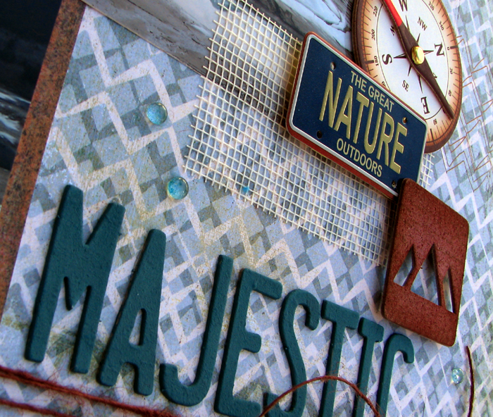
Majestic
While we camping this past May Long, we took a quick trip into Canmore, a near by town, to get some supplies. It's like this at the start of every camping season! There is always something we forgot or need and this trip was no different. Our little dog need a bathroom break so Steve pulled off the road onto this service road for the Dam and the views there were amazing!
I really loved this picture of the mountains and the lake. The ice was still on the shoreline and the mountains were reflecting on the lake. It felt like a scene out of a movie! So when I was printing the photos, I knew I really wanted this photo to be the focus so I took a page out of my freind Haley's book and printed it in 11x14 format. Really draws your attention doesn't it!
I picked up this grungeboard set design by Tim Holtz called Iconic and have been hoarding it for quite awhile. I pulled it out because I didn't have any Thickers that really went with the colors of this layout, shocking I know seen as I think I own almost every set of Thickers! I'm a bit addicted ... I admit it. Anyways, because the letters were grungeboard, meaning naked, I painted them using my Memory Makers paints mixing 3 different colors for the perfect match. After they dried, I roughed them up a bit with a sanding block. To my surprise I also found the cute little mountain range in the same grungeboard set so I decided to ink it up and use it too! See that cool mesh material, I bet you won't guess what it is! It's actually drywall tape found at any hardware store. Cool isn't it! I love the stuff and use it all the time. In fact, I am already on my second roll of it!
I have been going through this phase where I need to do a little something extra to almost all the embellishments on my layouts. It's kind of my way of making it my own. The chipboad circle was perfect for my layout but I felt it needed a little more dimension so I added some glossy accents to give it that epoxy look in the center. Also, my journalling die cut had flourished border that I found too fancy for the layout so I covered it with some ribbon that went better with my layout. Now both pieces fit perfectly with my layout and are unique too!
I really loved this picture of the mountains and the lake. The ice was still on the shoreline and the mountains were reflecting on the lake. It felt like a scene out of a movie! So when I was printing the photos, I knew I really wanted this photo to be the focus so I took a page out of my freind Haley's book and printed it in 11x14 format. Really draws your attention doesn't it!
I picked up this grungeboard set design by Tim Holtz called Iconic and have been hoarding it for quite awhile. I pulled it out because I didn't have any Thickers that really went with the colors of this layout, shocking I know seen as I think I own almost every set of Thickers! I'm a bit addicted ... I admit it. Anyways, because the letters were grungeboard, meaning naked, I painted them using my Memory Makers paints mixing 3 different colors for the perfect match. After they dried, I roughed them up a bit with a sanding block. To my surprise I also found the cute little mountain range in the same grungeboard set so I decided to ink it up and use it too! See that cool mesh material, I bet you won't guess what it is! It's actually drywall tape found at any hardware store. Cool isn't it! I love the stuff and use it all the time. In fact, I am already on my second roll of it!
I have been going through this phase where I need to do a little something extra to almost all the embellishments on my layouts. It's kind of my way of making it my own. The chipboad circle was perfect for my layout but I felt it needed a little more dimension so I added some glossy accents to give it that epoxy look in the center. Also, my journalling die cut had flourished border that I found too fancy for the layout so I covered it with some ribbon that went better with my layout. Now both pieces fit perfectly with my layout and are unique too!
Supplies: Patterned Paper: Basic Grey - Archaic Collection; Cardstock: Bazzills; Alphabet Stickers: Tim Holtz Gurngeboard - Iconic; Embellishments: Basic Grey - Archaic Chipboard, Tim Holtz Gurngeboard - Iconic, Making Meories Paint, Ribbon, Glass Beads, Drywall Tape, Karen Foster License Plates, and GCD Studios - The Great Outdoors Chipboard; Tools: Sanding Block.
Jun 21, 2011
Such Nice Guys
Happy first day of Summer to all you in the northern hemisphere! I am so looking forward to the long, warm summer days! I am an odd duck and winter is normally my favorite time of year but this year I am so excited about summer being here. I figure it's because this is the first year in many (since 2004) that I haven't had to do any landscaping!!! I am so looking forward to kicking back in my backyard, enjoying a cool drink and admiring all our hardwork!
I absolutely love how this layout turned out! I struggled a bit with my color choices by it quickly came together when I found several papers from an old Martha Stewart Scrap Pad I had laying around. They work perfectly with the pictures don't they?! The only thing I am regretting is the yellow flower brads. After I had them in place I had a D'oh moment and thought I should of used rain drops instead! Oh well!
I love this cute little umbrella that was a last minute add. I cut out a circle in my patterned paper and them cut in in half. Then using a border punch I punched along the flat side to give it the scalloped look. I then added some stitching and a button to the top. The handle was a pin that I threaded some beads on and then added underneath the umbrella top. Turned out perfect if I do say so myself!
I absolutely love how this layout turned out! I struggled a bit with my color choices by it quickly came together when I found several papers from an old Martha Stewart Scrap Pad I had laying around. They work perfectly with the pictures don't they?! The only thing I am regretting is the yellow flower brads. After I had them in place I had a D'oh moment and thought I should of used rain drops instead! Oh well!
I love this cute little umbrella that was a last minute add. I cut out a circle in my patterned paper and them cut in in half. Then using a border punch I punched along the flat side to give it the scalloped look. I then added some stitching and a button to the top. The handle was a pin that I threaded some beads on and then added underneath the umbrella top. Turned out perfect if I do say so myself!
Supplies: Patterned Paper: Martha Stewart - Essentials Paper Pad ; Alphabet Stickers: American Crafts Thickers; Embellishments: Brads, Pearls, Beads, Embroidery Floss, Ribbons, and Buttons; Tools: EK Success Scallop Border Punch.
May 24, 2011
La Musica
I really liked this chipboard journalling spot I got from a friend of mine and wanted to use it on this layout but I struggled with it. I tried several different strategies with it but for some reason nothing worked. I then decided to use it as the background for my title and went with the monochromatic look and it seemed to come together from there. At the end of it all I really like how it turned out and I find it suits the layout quite well. I'm so glad I decided to tough it out until I found something I liked!
Supplies: Patterned Paper: Martha Stewart Crafts - Essentials Paper Pad; Alphabet Stickers: American Crafts Thickers; Embellishments: Jillibean Bakers Twine and Brads; Tools: Typewriter.
Apr 30, 2011
Weekend in the Woods
It's One Page Sketch week over at Sketch Support and today is the day my project is featured. I am sad to say that this is my last project as Guest Designer. I have had such a great time working with Allison and Sketch Support and look forward to hopefully working with them again in the future. I sure hope you have enjoyed my projects this month and be sure to keep following Sketch Support for lots of great ideas ... I know I will! For all the details on this layout, please go to Sketch Support where you will see lots of photos and all the necessary info to recreate it. Thanks for all your kind words and support!
Apr 29, 2011
Oh Brother
I love my brother! He has always been the jokester but come on it was such a nice moment to photograph and was a wet willy that appropriate?! I guess I can now say I have photographic proof that he always starts it ... not me!
So today is one of those where were you when moments. Prince Charles and Diana got married when I was too young to remember. I remember where I was the day when Princess Diana tragically died and today is the day the Prince William marries his long time love, Kate. I am not big into the hoopla, although I did get up early (4am to be exact) to watch it, but I'm thinking I might try to download a photo of them and do a page about it. What about you?
Mar 31, 2011
Over the Mountains and Through the Woods
I wanted to use this title on this layout but the only way I could get it on the layout would be to put it over the photo. I wasn't keen on the idea because I didn't want to cover any of the large photo. I'm from the school of thinking that every detail in the photo is important. But I went with it and I think it ended up turning out pretty good. Goes to show that you can still cover part of a photo but still get the desired effect you wanted, even without every little detail.
Mar 25, 2011
Playa
I am the biggest procrastinator when it comes to journalling. I'm not sure why, it's just not my favorite part. I created this layout a while ago and had the blue rectangled on the layout waiting for journalling. When I finally mustered up the desire to journal, I realised that nothing would show up on the blue area. I struggled for a bit trying to some up with ideas, seeing as my white signo pen had decided to dry up, until I remembered my vellum. It has been so long since I used vellum on any layout! In fact, I had a hard time finding my vellum adhesive!
Feb 25, 2011
Pina Coladas
You are never going to guess where the inspiration for this layout came from. I was helping my husband do some research for his master's essay, which as basically browsing a bunch of websites, when I came across this website that inspired me. I wish I could remember which one it was but unfortunately I can't. So I am going to have to explain it for you. Basically, I took the website design and converted it to a sketch that I used for this layout. The green brads on the top right were where the website's navigation buttons were, the Pina Coladas title is where the website's title was, the Oh So Yummy title is where the product's title was, the photo on the left was the main product's photo, the photo on the right was a detailed photo of the product, and the journalling was the website's description of the product. Of course there was a bunch of other things on the website that I ignored but I think you'll get the picture! So next time you are stumped for an idea take a look at how some of your websites are laid out or even a magazine article you really like. You never know where you'll find inspiration!
Feb 15, 2011
Las Alamedas
And we are back with a new layout today. When I saw this collection by Cosmo Cricket, I thought it was perfect for my pictures of Cuba, in particular this layout about the restaurant we always ate at.
I decided to make this very pretty flower using some scraps from the collection. Isn't it pretty? Want to know how to make it? It's really easy. Come back tomorrow and I will have a tutorial on how to make it!
Jan 27, 2011
Detour to the '54 Cadillac
These are some of my favorite photos of Steve and I in Cuba. I just love the old cars there so when we made a pit stop on our way to Havana, we saw this old 1954 Cadillac that was in awesome condition and just had to have our photos taken.
Subscribe to:
Posts (Atom)